A simple, step-by-step lesson with graphite that will help students of all skill levels create a photorealistic portrait and understand chiaroscuro.
30 Keeps,
2 Likes,
0 Comments
THE PLAN
6 sessions; 55 minutes per session
1)SWBAT define value, gradients, contrast, photorealism and chiaroscuro
2)SWBAT use graphite pencils to shade correctly
3)SWBAT create from observation of a photo reference
4)SWBAT examine the work of Leonard Da Vinci and Chuck Close
Optional:
SWBAT optimize a photo reference using digital media
SWBAT understand a '3 quarter view' in portraiture.
1)Graphite Pencils of various hardness (minimum of 4B,HB and 2H)
2)8.5 x 11 standard printer paper, for photo references
3)9 x 12 100lb Brisol vellum or another heavy paper.
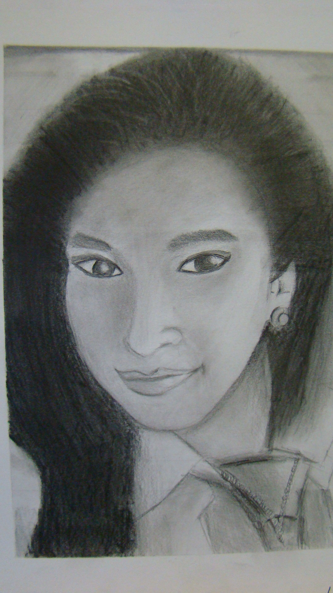
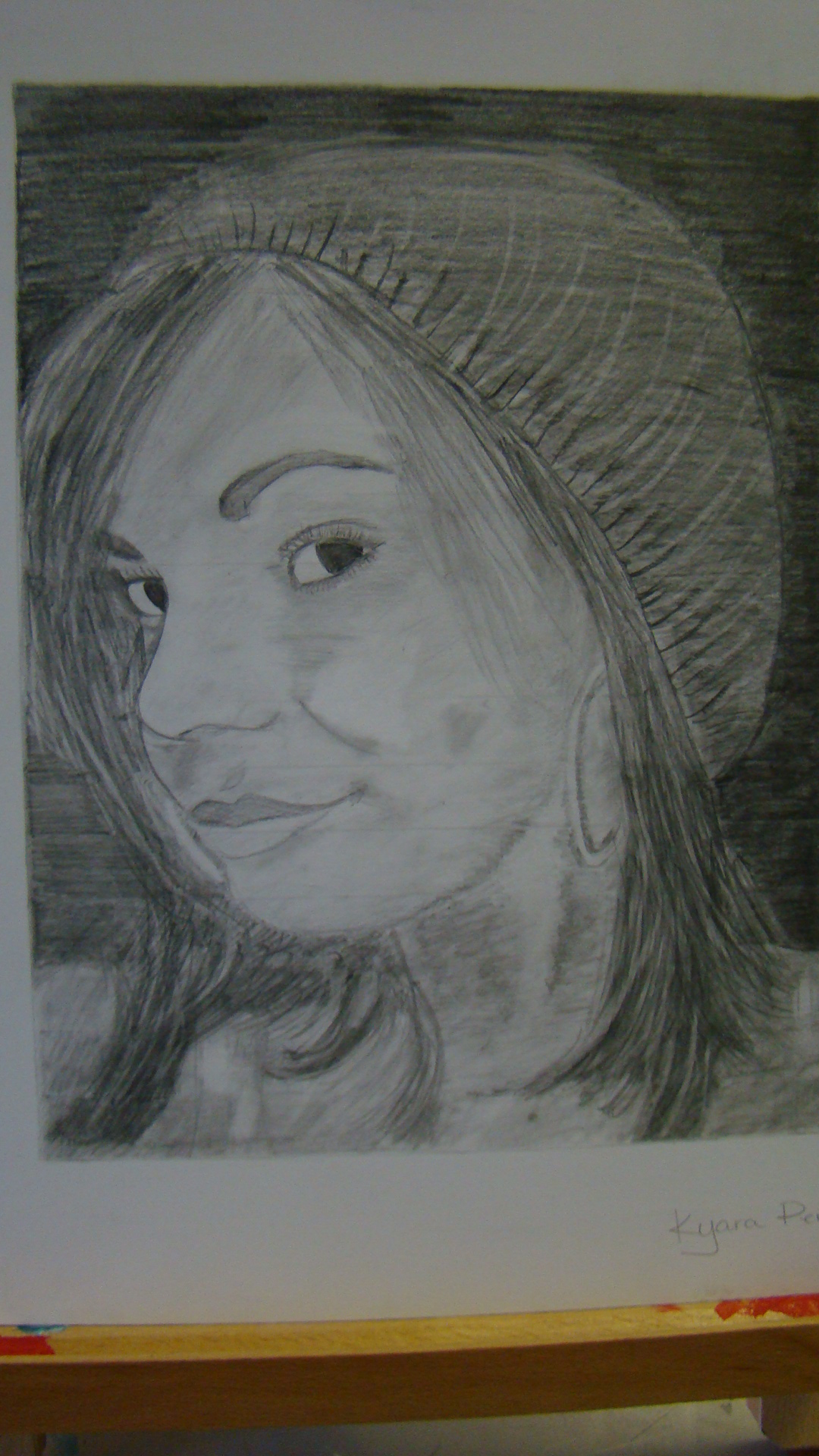
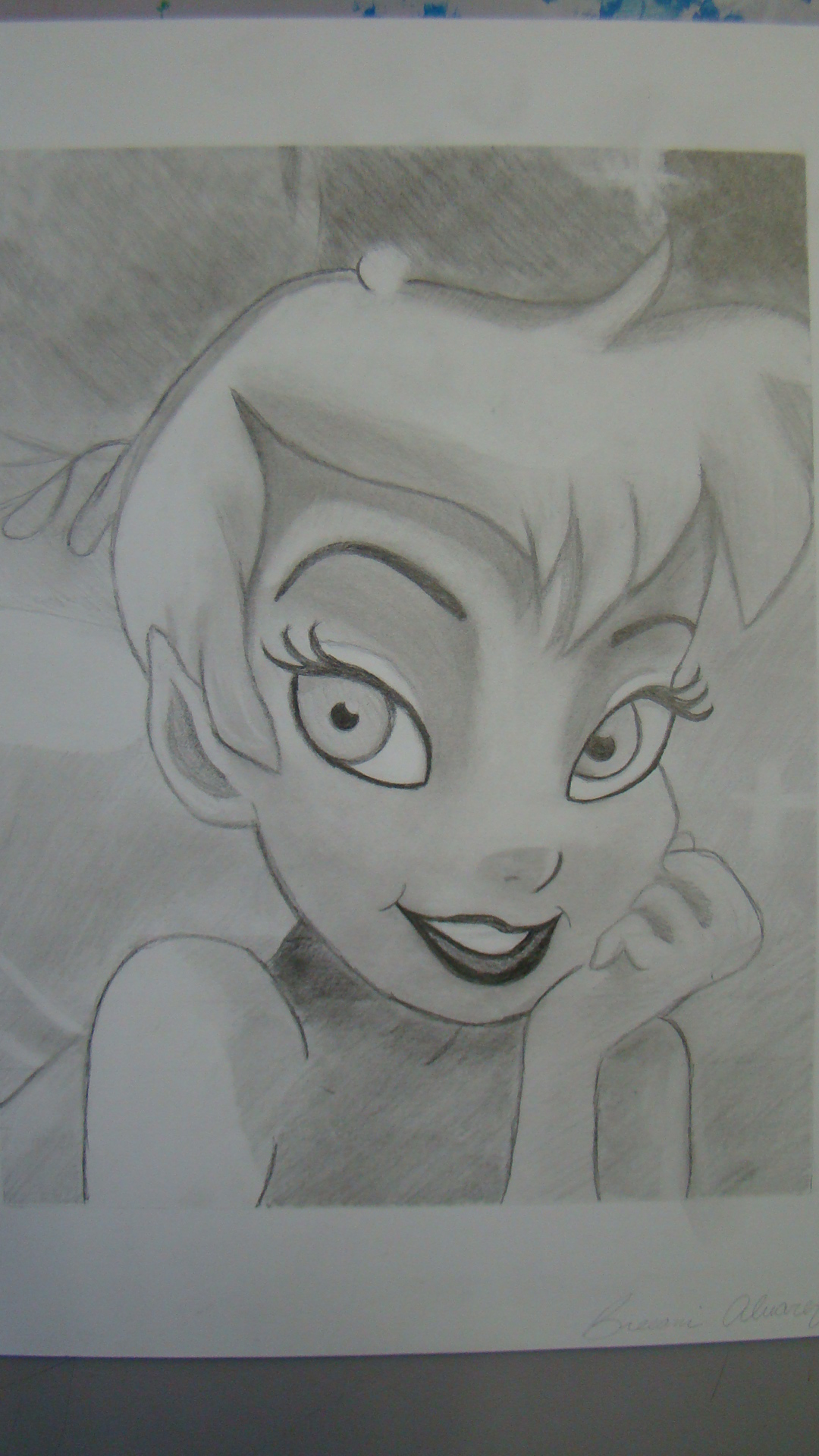
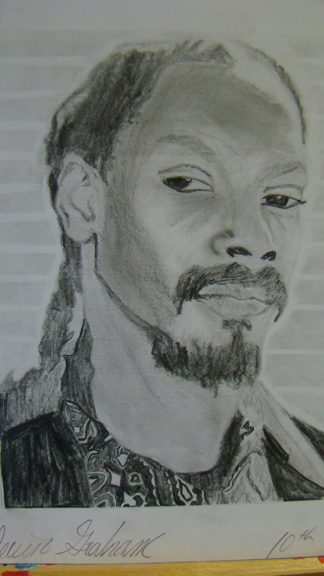
1)Students examine portraits created by Leonard Da Vinci and Chuck Close. They will identify and discuss the similarities and differences in appearance and production. The main conclusion is that dividing a work of art into steps or pieces will help us create.
2)Students use computers and the internet to find a reference image of the face of a person they admire. The picture should have diverse values and powerful contrast and ideally, be high resolution. (Optimize with Photoshop if you have the resource)
3)The picture the student found is printed in black and white.
4)This reference image is folded in half (folded like a hamburger, not a hot dog) 4 times. This will result in 16 horizontal rows or 'steps'. The students label each row with a number 1-16.
5)The students then have two choices for creating their artwork:
A)If they wish to create their art on regular printer paper, they follow the method from Step 3 and fold their blank paper in the same manner, resulting in 16 labeled rows.
B)If they wish to use Bristol Vellum, they must measure an 8.5x11 'window' in the center of their paper. Next, they will measure the width of a row from their folded reference image, this is usually around .75 of a an inch. They would then lightly mark each row division on either side of 8.5x11 border. When the marks are set, they will connect the coinciding marks with a light line and their 16 rows will be ready.
6)Most importantly: Students must work ROW BY ROW, one row at a time as they observe the reference and recreate the values on their blank paper. Working row by row will allow the students to concentrate on accurately recreating their image, rather than rushing to draw what they recognize and getting confused by trying to create the entire image at once.
7) When the image is complete students will clean up the border (if they have one) and mount their artwork on black paper for presentation.
Students will be assessed based on the attached rubric.

Share!
Comment!