Students will use seven Elements of Art and seven Principles of Design to complete a chalk pastel drawing that encompasses all of fourteen with a sense of unity.
18 Keeps,
7 Likes,
2 Comments
THE PLAN
6 sessions; 45 minutes per session
1. SWBAT visually define seven elements of art.
2. SWBAT visually define seven principles of design.
3. SWBAT effectively use pattern, rhythm, and color in their drawing.
4. SWBAT effectively combine forms with value concepts.
1. 12x18 Black Construction Paper
2. White Crayon (Oil, Wax, etc.)
3. Bright Colored Chalk Pastels
To keep things balanced and easy for students to create ways to remember and apply – stick to seven Principles and seven Elements.
Elements of Art: Line, Shape, Form, Color, Value, Texture, Space
Principles of Design: Unity, Balance, Contrast, Emphasis, Movement, Pattern, Rhythm
By putting the terms in front of them we can dissect them – we hold a conversation about each thing and not only where we’ve heard the word before but where we see the word in action – it doesn’t take long for students to realize that the elements and principles can be found nearly anywhere, especially in art and architecture. After dissecting the words and figuring out their meaning, citing examples and building other conclusions from them (i.e. Color can have a value, Rhythm plays into variety, etc.), students create a visual dictionary for the words! Have them draw pictures – not only does this help them define the word but it helps them practice and understand how to use it!
When students finish the visual dictionary, which usually takes and entire class period, we revisit a couple of the elements and principles students often struggle with – one of the toughest applications of terms is “value” which can be done numerous ways but start off with some of the more known ways – hatching, cross hatching, and shading/blending. Once again, do visual definitions and then we recreate a value scale to practice transitioning from dark to light with no breaks.
The second one students struggle with is the basics of drawing form – or three-dimensional objects. So, of course, practice this too – show them multiple ways to do this – first, simply sliding a duplicate of a shape back at an angle and connecting the corresponding points – revisit perspective and talk about vanishing points – apply whatever we can and practice shapes they are familiar with before challenging them with others. Before combining the two concepts, challenge them to figure out how we would make a circular as a sphere rather than a cylinder – within minutes, they realize how value can help them.
After, combine the two elements into a bigger challenge – adding value to 2D objects and finally, turning multiple shapes into forms and adding each different value technique to those shapes – keeping in mind that every side of the form will vary in value. Before we move into the chalk project, challenge students one step further by discussing light sources and how they can truly effect what a shape or form may look like –
Part 2: Drawing
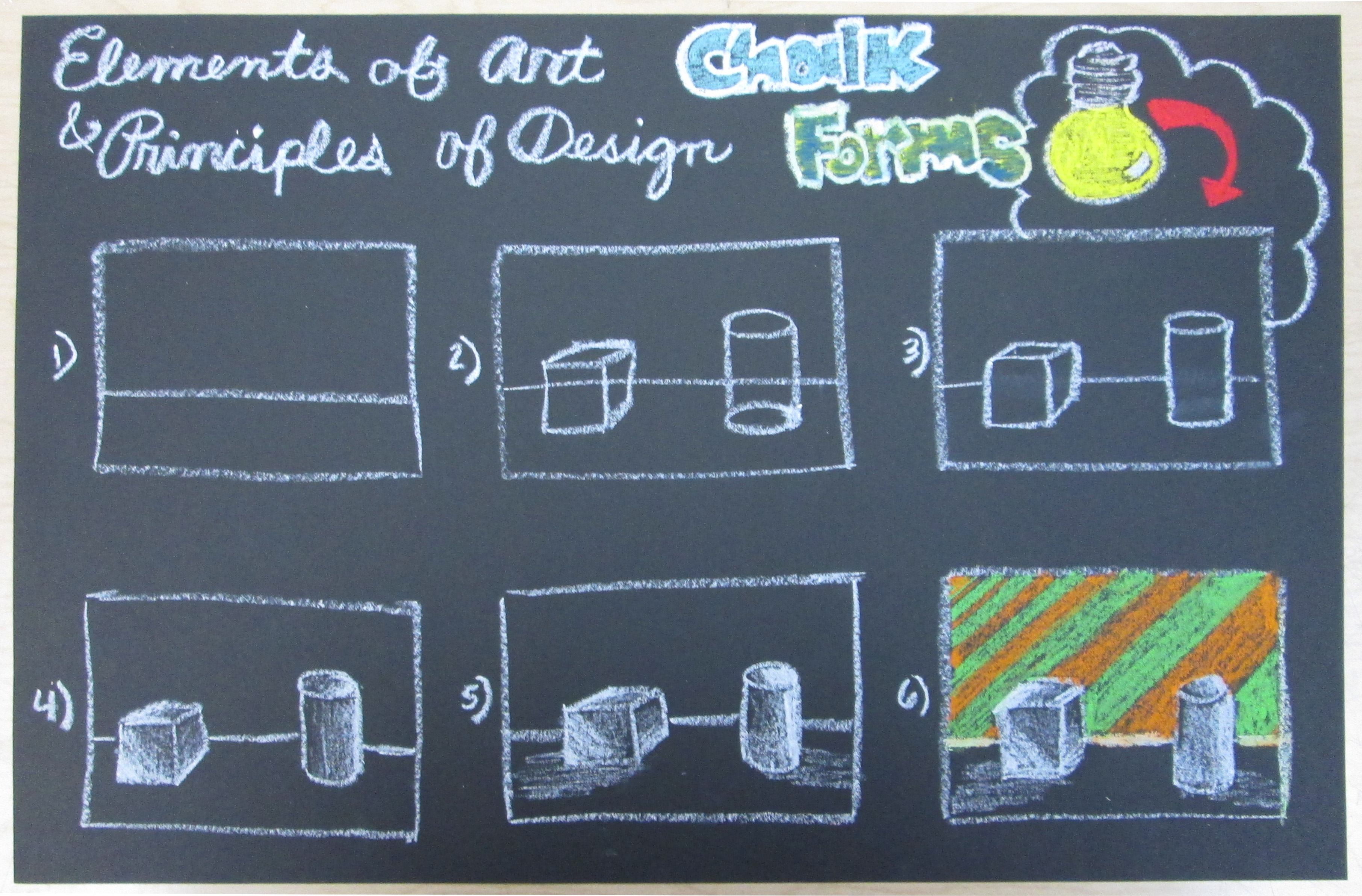
1. Students create a horizon line with the white crayon. Instruct them to draw it about a third from the bottom. (Because it is never bad to practice, I require that they don’t use rulers. You can draw a circle a hundred times with a stencil, but that doesn’t mean you know how to draw a circle – this simple requirement just pushes them to become more familiar with drawing straight lines, etc.)
*Elements present: Line, Space
2. Students draw two forms that “sit” on the bottom section – whatever forms they want, one on the right and one on the left. Have them draw these over the horizon line. Make sure that the bottom of each form is underneath the horizon line to portray accuracy.
*Elements present: Line, Space, Form, Shape
*Principles present: Balance
3. Students need to erase the horizon line going through their form and depending on the form, erase any lines that make it seem “see through”. (For example, on the attached image with steps drawn – on the cylinder, you’ll see that I erased the top of the bottom oval to make it solid.) At this point, it is also important to introduce a light source and talk about how the position of the light source effects step four.
*Elements present: Line, Space, Form
*Principles present: Balance
4. Students need to add value to their forms by thinking of their light source. Continue using the white crayon (this creates a great texture on their drawings as well as a strong contrast between the white and black). Because they have practice hatching, cross-hatching, and shading – students can pick which one they enjoy more (typically shading/blending). (I also talk about how different surfaces require different attention – i.e. it’s best to shade flat surfaces with straight direction and curved with rounded direction – exceptions apply, of course – seeing that a cylinder looks more geometric with straight sides. It’s a great conversation to have because it reiterates that “there are 100 ways to do something”.)
*Elements present: Line, Space, Form, Shape, Value, Texture
*Principles present: Balance, Contrast
5. Students are introduced to shadows. Help students understand that shadows show up because light is blocked. (For instance, if someone is standing facing the sun, their shadow will develop behind them because light is blocked. In comparison, a shadow shows up in front if us is the sun is behind us. This applies to light sources. ) Have students apply their discussion knowledge to their drawing by adding shadows.
*Elements present: Line, Space, Form, Shape, Value, Texture
*Principles present: Balance, Contrast
6. Students begin working on their background. This is where we pull in the remaining six components. Students only concentrate on their background at this point. To emphasis the forms, students will use pattern, rhythm, and color on their background. We review patterns (something repeating), and discuss rhythm (patterns that vary) and how colors compliment each other depending on what you put together – and that it’s probably best to stay away from black or white because it would not help keep the forms emphasized. An example would be what you see in the imagine, the colors orange and green are repeated while the line size varies. (By creating a pattern with rhythm, students also note the movement created because our eyes want to continue through the entire pattern.) By including 13/14 elements and principles – students have decided that we can add the 14th piece in there, unity because when using colors that work together in a scheme and having all the elements and principles present, it’s truly part of our drawings.
*Elements present: Line, Space, Form, Shape, Value, Texture, Color
*Principles present: Balance, Contrast, Emphasis, Pattern, Rhythm, Movement, Unity
I use a consistent form of assessment aligned with standards and rubrics. The rubric attached shows is set up so that students can review it ahead of time, goal set and when a project is completed, students self-assess, peer-assess and write written responses prompted by essential questions.
This is a GREAT unit to start a trimester off because it sets the foundation for your term with the students - they can be revisited and help in every project.
THE STANDARDS
Visual Arts Standard 1: Understanding and applying media, techniques, and processes
[5-8] Students select media, techniques, and processes; analyze what makes them effective or not effective in communicating ideas; and reflect upon the effectiveness of their choices
Visual Arts Standard 2: Using knowledge of structures and functions
[5-8] Students select and use the qualities of structures and functions of art to improve communication of their ideas
Visual Arts Standard 3: Choosing and evaluating a range of subject matter, symbols, and ideas
[5-8] Students integrate visual, spatial, and temporal concepts with content to communicate intended meaning in their artworks
Visual Arts Standard 5: Reflecting upon and assessing the characteristics and merits of their work and the work of others
[5-8] Students compare multiple purposes for creating works of art


Share!
Comment!